Scoring genre clarity...

Dead Space capsule

Dead Space

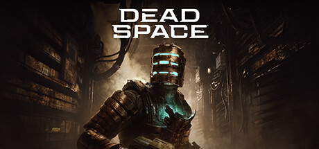
The sci-fi survival-horror classic returns, completely rebuilt to offer an even more immersive experience — including visual, audio, and gameplay improvements — while staying faithful to the original game’s thrilling vision.

$5.99Very Positive(1,367)
HorrorThird-Person ShooterSurvival Horror
MotiveJan 27, 2023

Dead Space scores 90/100 — better than 100% of Horror capsules (n=3,212).

Very Positive (1,367 reviews) · $5.99 · Released Jan 27, 2023 · By Motive

Quick text summary

Dead Space scored 90/100 on Steam Analyzer — Excellent for a Horror capsule. Top priority fix: [contrast_color] Increase saturation or brightness of the cyan chest panel slightly to make it command even more immediate attention at SMALL and TINY sizes

Capsule scores by dimension

  • Genre Clarity: 9/10 — Sci-fi horror instantly recognizable. The armored protagonist with glowing cyan chest panel and industrial gothic setting immediately signal survival-horror sci-fi. The heavy combat suit, oppressive metallic environment, and eerie atmospheric lighting perfectly communicate the genre. At TINY size, the silhouette and glowing torso accent remain unmistakable markers of action-horror gameplay.
  • Title Readability: 9/10 — Bold white sans-serif flawlessly legible. DEAD SPACE appears in clean, uppercase sans-serif with excellent letter spacing and strong white-on-dark contrast. The title is positioned in the upper-middle safe zone against a controlled background region, maintaining clarity at all sizes. Even at TINY size, the large, evenly-spaced letterforms remain fully readable without any collapse or blur.
  • Contrast & Color: 9/10 — Striking cyan-gold separation on dark. The protagonist's glowing cyan chest panel and golden-brown armor create a powerful value and hue contrast against the dark industrial background. The light source on the figure separates cleanly from the murky brown-gray environment, and the cyan accent reads distinctly even in grayscale. At TINY size, the figure still has clear silhouette definition and pops against the Steam dark background.
  • Uniqueness & Polish: 9/10 — Premium craft with iconic design. The composition demonstrates exceptional art direction with layered depth, carefully controlled lighting, and a hero pose that conveys agency and danger. The glowing cyan torso is a signature visual hook unique to Dead Space, instantly distinguishing it from generic sci-fi covers. The weathered, industrial aesthetic and atmospheric fog effects show professional polish consistent with AAA production values.
  • Brand Consistency: 9/10 — Iconic protagonist and color signature. The armored suit silhouette and cyan-lit chest panel are immediately recognizable Dead Space brand markers that would carry across all marketing materials. The warm industrial palette and oppressive gothic environment align with the franchise's established visual identity. The design would be instantly recalled by fans and clearly connected to the Dead Space brand ecosystem.
  • Composition: 9/10 — Masterful hierarchy and focal balance. The protagonist occupies the center-right focal point with clear depth layering: foreground figure, midground industrial structure, and hazy background environment. Title placement in the upper zone balances the composition without competing for attention. The arrangement remains spatially coherent at all sizes, with safe margins respected and no critical elements at edge-crop risk.

What works

  • Iconic cyan glowing accent. The bright cyan-lit chest panel creates a memorable signature visual that instantly identifies the Dead Space brand and cuts through visual noise at any size.
  • Flawless title contrast and legibility. Crisp white sans-serif with excellent spacing remains perfectly readable from full-size down to TINY, positioned on a controlled dark background with no competing visual interference.
  • Professional atmospheric depth. Layered fog, directional lighting, and clear foreground-midground-background separation create a sophisticated AAA-caliber visual that communicates production quality immediately.
  • Strong genre signaling through silhouette. The heavy combat suit, oppressive industrial setting, and eerie lighting palette unmistakably communicate survival-horror sci-fi gameplay without ambiguity.

What hurts the capsule

  • Minimal supporting visual interest. The background environment, while atmospheric, remains largely dark and undifferentiated, offering limited additional visual hooks beyond the central figure.
  • Warm palette slightly mutes the cyan. The dominant golden-brown tones and dark grays reduce the cyan accent's visual dominance slightly, though it still reads clearly against the Steam background.

Priority fixes

  1. [contrast_color] Increase saturation or brightness of the cyan chest panel slightly to make it command even more immediate attention at SMALL and TINY sizes
  2. [composition] Consider subtle environmental detail in the background (electrical elements, alien biomass) to add secondary focal points without cluttering the hierarchy

Store copy priority fixes

  1. [feature_communication] Add a sentence explicitly describing signature mechanics such as 'dismember and defeat Necromorphs by targeting their limbs with upgraded engineering tools' to showcase gameplay depth.
  2. [uniqueness] Insert a line contrasting the remake's gameplay or content additions versus the original, e.g., 'expanded narrative' is mentioned but not what that expansion delivers concretely.
  3. [feature_communication] Define what 'strategic gameplay' means in practice, e.g., 'manage limited resources while adapting your tool loadout to evolving enemy threats' to replace vague marketing language.

Related guides

Steam app ID: 1693980 · Tags: Horror, Third-Person Shooter, Survival Horror, Space, Sci-fi