Scoring genre clarity...

Project Kat - Paper Lily Prologue capsule

Project Kat - Paper Lily Prologue

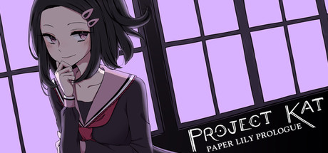
Project Kat is a short, unconventional RPG horror game in which there is always another way. Solve puzzles, make friends (or not), and guide Kat as she attempts to uncover the mystery behind a strange golden letter.

Free to PlayOverwhelmingly Positive(48)
Psychological HorrorPixel GraphicsAnime
Leef 6010Oct 15, 2021

Project Kat - Paper Lily Prologue scores 70/100 — better than 35% of Psychological Horror capsules (n=2,215).

Overwhelmingly Positive (48 reviews) · Free to Play · Released Oct 15, 2021 · By Leef 6010

Quick text summary

Project Kat - Paper Lily Prologue scored 70/100 on Steam Analyzer — Good for a Psychological Horror capsule. Top priority fix: [genre_clarity] Add a subtle visual element that hints at puzzle or mystery—such as a golden letter, strange object, or environment detail in the background to better communicate the core game hook.

Capsule scores by dimension

  • Genre Clarity: 7/10 — Anime RPG with mystery undertones. The character-focused illustration and school uniform setting clearly signal a story-driven game, likely RPG or visual novel adjacent. At tiny size, the anime art style and character pose remain recognizable, though the specific 'horror' or 'puzzle' elements are not immediately obvious from visuals alone. Genre messaging relies heavily on character aesthetics rather than gameplay iconography.
  • Title Readability: 8/10 — Clear title, readable at all sizes. The title 'PROJECT KAT' in white sans-serif font sits on a dark background region with strong contrast, making it legible at full, small, and tiny sizes. The subtitle 'PAPER LILY PROLOGUE' is smaller but still readable at small size. At tiny size, 'PROJECT KAT' remains the dominant readable element, though the subtitle becomes soft; overall the design prioritizes the main title effectively.
  • Contrast & Color: 7/10 — Good separation with warm-cool split. The bright lavender-pink background contrasts well against the Steam dark theme, and the character's dark silhouette separates cleanly from the light background. The black grid lines and dark clothing create strong value separation. However, the overall palette sits in a warm-cool mid-range where some detail on the character becomes slightly murky; grayscale squint test shows decent but not exceptional silhouette clarity.
  • Uniqueness & Polish: 7/10 — Polished anime aesthetic, moderate distinction. The execution is clean with smooth line work, intentional color palette, and a contemplative character pose that conveys narrative intrigue. However, the design relies on familiar anime visual tropes without a distinctive visual hook that separates it from other anime-styled indie games. The window grid and character study composition feel competent but not particularly memorable or unique compared to games like Metaphor or Persona 3 Reload.
  • Brand Consistency: 6/10 — Consistent character-centric presentation. The capsule shows a single character (Kat) as the focal point with a muted, introspective color scheme and clean typography. Without reference to other marketing materials, the internal consistency is solid—monochrome character on a controlled background with no tonal conflicts. However, there are no immediately iconic motifs, symbols, or signature visual hooks that would make this capsule distinctly recognizable as 'Project Kat' without the title text.
  • Composition: 7/10 — Balanced character focus, minor edge concerns. The character sits left-center with title text anchored right, creating clear visual hierarchy and focal point. The grid lines add depth without overwhelming the composition. Title placement on the right side is safe from Steam's edge cropping. The lower-right area shows some empty space that could be filled, but the asymmetry works intentionally; at tiny size, the character silhouette remains the primary read.

What works

  • Strong title contrast and placement. White sans-serif title on dark background reads cleanly at all sizes and sits safely away from edge crop zones.
  • Clean visual hierarchy. Character silhouette dominates left side; title anchors right; no competing focal points scatter attention.
  • Cohesive color palette. Lavender background, dark character, and pink accent create a unified mood that reads well at small and tiny sizes.

What hurts the capsule

  • Generic anime visual tropes. School uniform, contemplative pose, and art style are common across many indie games, offering limited distinctiveness.
  • No gameplay visual cues. The capsule communicates character and mood but gives no hint of puzzle, horror, or unconventional RPG mechanics mentioned in the description.
  • Subtitle legibility at tiny size. The 'PAPER LILY PROLOGUE' tagline becomes too small to read reliably at true thumbnail size, diluting brand message.

Priority fixes

  1. [genre_clarity] Add a subtle visual element that hints at puzzle or mystery—such as a golden letter, strange object, or environment detail in the background to better communicate the core game hook.
  2. [uniqueness_polish] Consider introducing a distinctive visual motif or color accent unique to Kat's character design that could serve as a brand identifier across marketing materials.
  3. [composition] Evaluate whether a secondary supporting element or icon could occupy the lower-right empty space without cluttering, improving prime real estate utilization.

Store copy priority fixes

  1. [feature_communication] Replace or supplement the absurdist feature list with 1–2 concrete examples of how puzzle multiplicity works in practice (e.g., 'solve a door puzzle by lock-picking, sneaking through a window, or befriending a classmate who has a key').
  2. [genre_clarity] Add 1–2 sentences clarifying the balance between psychological horror and comedic tone in the prologue, or front-load horror language in the short description to set expectations for tone-sensitive audiences.
  3. [feature_communication] Expand the minigames section to explain what role desk-pushing, lock-picking, and séance debunking play in puzzle-solving, rather than listing them as isolated oddities.

Related guides

Steam app ID: 1698960 · Tags: Psychological Horror, Pixel Graphics, Anime, Story Rich, RPG