Scoring genre clarity...

Poppy Playtime capsule

Poppy Playtime

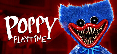
You must stay alive in this horror/puzzle adventure. Try to survive the vengeful toys waiting for you in the abandoned toy factory. Use your GrabPack to hack electrical circuits or nab anything from afar. Explore the mysterious facility... and don't get caught.

Free to PlayVery Positive(1,634)
HorrorSingleplayerFree to Play
Mob EntertainmentOct 12, 2021

Poppy Playtime scores 85/100 — better than 99% of Horror capsules (n=3,210).

Very Positive (1,634 reviews) · Free to Play · Released Oct 12, 2021 · By Mob Entertainment

Quick text summary

Poppy Playtime scored 85/100 on Steam Analyzer — Excellent for a Horror capsule. Top priority fix: [title_readability] Increase the size and weight of 'PLAYTIME' relative to 'POPPY' so the full title remains legible at 120x45 pixels, or add a subtle drop shadow or outline to the text.

Capsule scores by dimension

  • Genre Clarity: 9/10 — Horror toy factory unmistakable. The blue fuzzy monster with an enormous gaping jaw full of sharp teeth against a blood-red background immediately communicates horror. The subverted toy aesthetic — cute creature made terrifying — signals the horror-puzzle-adventure subgenre with unusual precision. Even at tiny size, the monstrous face and red backdrop leave no ambiguity about the tone.
  • Title Readability: 8/10 — Legible hand-drawn logo holds well. The white hand-drawn serif title 'POPPY PLAYTIME' contrasts well against the dark red background on the left side, with 'POPPY' in larger lettering providing clear hierarchy. At small size the two-word stack reads acceptably, though 'PLAYTIME' in smaller text starts to blur at tiny size. The placement on a relatively uncluttered left region is a smart compositional choice.
  • Contrast & Color: 9/10 — Bold red blue contrast pops hard. The vivid blue furry character against a deep crimson-red background creates exceptional value and hue contrast that survives grayscale and quick-scroll tests. The white teeth form a bright focal ring that draws the eye immediately. Against Steam's dark #1b2838 background, the warm red border creates strong separation, making the capsule pop distinctly from surrounding tiles.
  • Uniqueness & Polish: 8/10 — Subverted toy horror hook is strong. The juxtaposition of a fuzzy children's toy aesthetic with a grotesque horror execution is a memorable and distinctive visual concept that sets this apart from generic horror capsules relying on shadows and skulls. The craft is solid — the fur texture, the glassy dead eyes, and the oversized toothy grin are all rendered with clear intentionality. Compared to top-tier benchmark capsules it lacks some compositional sophistication but the core concept is genuinely distinctive.
  • Brand Consistency: 9/10 — Huggy Wuggy is iconic brand anchor. Huggy Wuggy has become one of the most recognizable mascot characters in indie horror gaming, and this capsule leads with him front and center, creating an immediately iconic brand signal. The red-and-blue palette, the hand-drawn logo treatment, and the toy-horror visual language form a coherent and memorable identity. Any returning player or someone who has seen the character elsewhere will recognize this instantly.
  • Composition: 8/10 — Strong focal face right side anchor. The character occupies the right two-thirds of the frame with his face centered just right of middle, creating a clear dominant focal point with the title text balancing him on the left — a classic and effective split composition. The slight upward angle and cropping at the bottom create a looming, threatening presence. At small and tiny sizes the face remains the undisputed primary read, though the title begins competing slightly at the smallest crop.

What works

  • Instantly iconic character. Huggy Wuggy's distinctive blue fur and massive toothy grin create an immediately recognizable mascot that reads clearly even at 120x45 pixels.
  • Exceptional color contrast. The vivid blue-on-red palette creates strong hue and value separation that stands out sharply against Steam's dark background in quick-scroll conditions.
  • Genre tone is unambiguous. The horror subversion of a cute toy aesthetic communicates the game's core premise — friendly-looking but terrifying — without any supporting text needed.
  • Balanced left-right composition. Title text anchors the left while the character dominates the right, creating a clean two-element hierarchy that avoids clutter.

What hurts the capsule

  • Tagline absent but fine at this scale. There is no supporting tagline or genre descriptor, which is acceptable given the strong visual communication but slightly limits context for new viewers.
  • PLAYTIME text softens at tiny size. The smaller 'PLAYTIME' word beneath 'POPPY' becomes difficult to read at 120x45, reducing the full title's legibility at the smallest display size.
  • Background detail is minimal. The red background offers little environmental context about the toy factory setting, missing an opportunity to deepen narrative communication.
  • Lower body crops awkwardly. The character's body fades into darkness at the bottom edge in a slightly abrupt way that feels unresolved rather than dramatically intentional.

Priority fixes

  1. [title_readability] Increase the size and weight of 'PLAYTIME' relative to 'POPPY' so the full title remains legible at 120x45 pixels, or add a subtle drop shadow or outline to the text.
  2. [uniqueness_polish] Introduce a subtle environmental element in the background — such as a blurred factory shelf or toy parts — to reinforce the setting and add depth without cluttering the focal character.
  3. [composition] Refine the bottom fade of the character with a more deliberate vignette or a ground shadow to make the crop feel intentional rather than abruptly cut off.
  4. [contrast_color] Add a very subtle rim light or glow around the character's silhouette to ensure clean edge separation in grayscale and at tiny thumbnail sizes.

Store copy priority fixes

  1. [feature_communication] Add specific examples of puzzle types or toy encounter mechanics (e.g., 'evade Huggy by solving door lock puzzles' or 'use your GrabPack wire to electrify circuits and unlock paths') to clarify moment-to-moment gameplay beyond the GrabPack.
  2. [audience_targeting] Insert a brief sentence signaling the intended player: 'Perfect for fans of first-person horror who enjoy puzzle-solving over combat' or similar, to help self-selection.
  3. [hook_strength] Strengthen the uniqueness angle by rewriting the opening to lead with what sets Poppy Playtime apart: 'Uncover the dark secrets of an abandoned toy factory where your only tool is a sentient GrabPack' or similar, rather than generic 'stay alive' framing.
  4. [tone_match] Move or reframe the DLC disclaimer to a separate note below the main copy to avoid undercutting the atmospheric tone of the main description.

Related guides

Steam app ID: 1721470 · Tags: Horror, Singleplayer, Free to Play, Puzzle, First-Person