Scoring genre clarity...

Amnesia: The Bunker capsule

Amnesia: The Bunker

Amnesia: The Bunker is a first-person horror game set in a WW1 bunker. A relentless, AI-driven monster stalks you. Survival depends on finding tools, crafting items, and keeping the lights on.

$8.49Very Positive(145)
HorrorSurvival HorrorAtmospheric
Frictional GamesJun 6, 2023

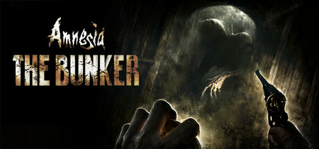
Amnesia: The Bunker scores 82/100 — better than 96% of Horror capsules (n=3,210).

Very Positive (145 reviews) · $8.49 · Released Jun 6, 2023 · By Frictional Games

Quick text summary

Amnesia: The Bunker scored 82/100 on Steam Analyzer — Good for a Horror capsule. Top priority fix: [title_readability] Increase the weight and size of the 'Amnesia' script logo or add a subtle drop shadow or outer glow so it remains legible at 120x45 pixel display sizes

Capsule scores by dimension

  • Genre Clarity: 9/10 — First-person horror instantly clear. The first-person perspective gun barrel in the lower center combined with the looming grotesque creature directly above communicates survival horror unambiguously. The dark, desaturated WW1 bunker atmosphere further signals the setting and tone. Even at tiny size, the creature-versus-player tension reads immediately and genre is unmistakable.
  • Title Readability: 8/10 — Title reads well at most sizes. The 'Amnesia' script logo in white with rough hand-drawn styling sits clearly in the upper right against a dark background, and 'THE BUNKER' below it uses a large gold textured serif that commands strong presence at full and small sizes. At tiny size the 'Amnesia' script becomes somewhat difficult to parse due to its decorative letterforms, though 'THE BUNKER' remains legible. The right-side placement on a relatively clean dark region is a smart compositional choice.
  • Contrast & Color: 8/10 — Strong dark contrast, creature pops. The near-black background and heavily desaturated palette create strong separation between the pale, highlighted creature and the dark surroundings, working well against Steam's #1b2838 dark UI. The gold tones of 'THE BUNKER' text provide warm accent contrast against the cold dark tones. In grayscale the creature silhouette and gun barrel both hold their separation cleanly, though the mid-section between creature and player has some muddy mid-tone blending that softens edge clarity slightly at tiny size.
  • Uniqueness & Polish: 8/10 — Polished horror craft, distinctive angle. The first-person perspective framing is a standout choice that communicates both gameplay mechanic and threat level simultaneously, setting it apart from typical character-showcase capsules in the horror genre. The creature design is distinctive and well-rendered with strong detail. Compared to genre benchmarks like Resident Evil 4 and DREDGE, this capsule earns its place through a genuine gameplay-communicating composition rather than a generic posed character shot.
  • Brand Consistency: 8/10 — Cohesive horror identity, franchise cues. The scratchy, hand-lettered 'Amnesia' logo style is a recognizable franchise identifier consistent with prior Amnesia branding, lending immediate recognition for series fans. The desaturated dark palette, grotesque monster aesthetic, and helpless first-person framing are all internally cohesive and consistent with what the game delivers. The gold texture on 'THE BUNKER' differentiates this entry while still feeling part of the same family.
  • Composition: 8/10 — Dynamic diagonal tension, clear focal points. The composition creates a strong diagonal tension from the gun barrel in the lower center to the creature looming in the upper left, with the title text anchoring the right side to balance the visual weight. The layering of foreground gun, midground creature, and dark background gives clear depth. At small and tiny sizes the two key elements — creature and gun — remain the dominant read, though at very small sizes the title text cluster on the right can feel slightly dense compared to the open left side of the image.

What works

  • First-person framing communicates gameplay. The gun barrel POV immediately tells players this is a first-person survival experience, a rare capsule that shows the actual play perspective rather than a generic character pose.
  • Creature silhouette is highly distinctive. The grotesque, multi-limbed creature in the upper left has a unique silhouette that stands out in genre browsing and creates immediate emotional impact.
  • Gold textured title lettering provides warm contrast. 'THE BUNKER' in large gold serif text contrasts effectively against the cold dark tones and remains readable down to small thumbnail sizes.
  • Franchise logo placement is smart and clean. The 'Amnesia' script sits on a dark controlled region of the image, maximizing legibility without fighting with background texture.

What hurts the capsule

  • Decorative 'Amnesia' script collapses at tiny size. The hand-drawn script lettering for 'Amnesia' loses legibility at approximately 120x45 pixels, making the franchise branding unreadable at the smallest Steam display sizes.
  • Mid-image tonal muddiness reduces separation. The transitional zone between the creature's lower body and the dark background has muddy mid-tones that reduce edge clarity in grayscale and at very small sizes.
  • Left side composition feels slightly unbalanced at small size. With the title text all pushed to the right, the left half of the image becomes visually dominant with the creature, creating a slight imbalance when cropped to small capsule dimensions.
  • No environmental WW1 cues visible at tiny size. The bunker setting that differentiates this from generic monster-horror games is not readable at tiny size, losing a key selling point in the smallest browsing contexts.

Priority fixes

  1. [title_readability] Increase the weight and size of the 'Amnesia' script logo or add a subtle drop shadow or outer glow so it remains legible at 120x45 pixel display sizes
  2. [contrast_color] Add a subtle edge highlight or rim light to the creature's lower body silhouette to reduce mid-tone blending and improve grayscale separation at tiny size
  3. [genre_clarity] Consider adding a faint environmental detail such as bunker wall texture or a hanging light to reinforce the WW1 setting even at small sizes without cluttering the composition
  4. [composition] Slightly shift the title text block leftward or reduce its vertical stacking to better balance visual weight across the full capsule width at small sizes

Store copy priority fixes

  1. [feature_communication] Expand the 'About the Game' section with 1-2 sentences explaining the monster's behavior (e.g., 'The creature hunts by sound and light—silence and darkness are your weapons, but isolation breeds panic'). This clarifies the core tension between survival tools and psychological cost.
  2. [feature_communication] Add a brief sentence in the short description or early detailed copy explaining how light and sound management translates to gameplay (e.g., 'Your dynamo flashlight draws power and attention—use it wisely'). The mechanic is central but currently underexplained.
  3. [hook_strength] Move the 'About the Game' opening paragraph ('Left all alone...') to immediately follow the short description, before the Halloween Update section, to maintain narrative momentum for first-time readers.
  4. [uniqueness] Add a sentence contrasting the AI-driven sandbox approach to scripted or puzzle-locked survival games (e.g., 'Unlike linear horror games, no two escapes are identical—the monster adapts to your tactics'). This sharpens differentiation from genre peers.

Related guides

Steam app ID: 1944430 · Tags: Horror, Survival Horror, Atmospheric, Immersive Sim, Stealth