Scoring genre clarity...

Mouthwashing capsule

Mouthwashing

The five crew members of the Tulpar are stranded in the empty reaches of space, shrouded in perpetual sunset. God is not watching.

$7.79Overwhelmingly Positive(538)
Psychological HorrorHorrorStory Rich
Wrong OrganSep 26, 2024

Mouthwashing scores 72/100 — better than 48% of Psychological Horror capsules (n=2,215).

Overwhelmingly Positive (538 reviews) · $7.79 · Released Sep 26, 2024 · By Wrong Organ

Quick text summary

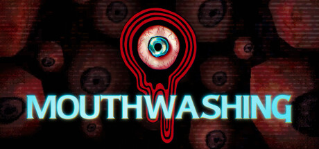
Mouthwashing scored 72/100 on Steam Analyzer — Good for a Psychological Horror capsule. Top priority fix: [contrast_color] Darken or reduce opacity of background mouth pattern to strengthen focal point separation and prevent mid-tone blending at TINY size

Capsule scores by dimension

  • Genre Clarity: 5/10 — Unclear genre, surreal horror tone. The eyeball icon with red concentric circles and unsettling imagery strongly suggests psychological horror or cosmic dread, but the adventure/indie tag is not visually reinforced. At TINY size, the grotesque eye dominates perception and reads as horror-survival rather than adventure, creating genre confusion that undermines discoverability expectations.
  • Title Readability: 8/10 — Bold cyan text, clear at all sizes. MOUTHWASHING is rendered in bright cyan all-caps sans-serif with strong contrast against the dark background and red eye symbol. The title remains legible at SMALL and TINY sizes due to thick letterforms and strategic horizontal placement that avoids the busy eye element above.
  • Contrast & Color: 7/10 — Strong cyan-to-dark separation with muddy background. The bright cyan title and red eyeball create excellent value contrast against the #1b2838 background and dark red texture. However, the blurred mouths and repeated eye pattern in the background blend into mid-tone mud, reducing overall silhouette clarity; at TINY size the background noise competes with the main focal point.
  • Uniqueness & Polish: 8/10 — Distinctive grotesque aesthetic, premium craft. The grotesque bloodshot eye with red vector ringlets and repeated mouth motif conveys a memorable, unsettling identity that stands apart from typical adventure game capsules. The design feels intentional and cohesive, signaling a niche psychological narrative experience rather than generic exploration gameplay.
  • Brand Consistency: 8/10 — Strong iconic motif, recognizable identity. The eyeball symbol with concentric red circles and the mouth pattern establish a distinctive visual language that would be recognizable across promotional materials. The color palette (cyan, red, dark red, black) and grotesque surrealism create a consistent brand voice that aligns with the game's unsettling narrative premise.
  • Composition: 7/10 — Clear focal point, minor background clutter. The eyeball centered in the upper-middle area creates a strong primary focal point with the title anchored below in a balanced horizontal layout. The repeated mouth pattern in the background provides texture and thematic reinforcement but adds visual noise that slightly dilutes impact at TINY size; overall structure is resilient to cropping.

What works

  • Memorable grotesque motif. The eyeball with red concentric circles is instantly distinctive and creates strong brand recall compared to generic adventure capsules.
  • Excellent title legibility. Cyan all-caps sans-serif maintains perfect readability from full size down to TINY thumbnails with no loss of clarity.
  • Cohesive unsettling aesthetic. Every element reinforces psychological horror and surrealism, creating a unified artistic vision that communicates tone without text.

What hurts the capsule

  • Genre mismatch on store categorization. The visual language strongly implies horror-survival but the game is tagged Adventure/Indie, which may mislead browsers expecting traditional adventure gameplay.
  • Background texture competes at small sizes. The repeated mouth pattern and blurred eye elements in the background create mid-tone mud that dilutes primary focal point separation at SMALL and TINY viewing sizes.
  • Dark palette limits value separation. The dark red textures and black background reduce overall contrast range, making the capsule feel slightly muted compared to higher-saturation competitor games.

Priority fixes

  1. [contrast_color] Darken or reduce opacity of background mouth pattern to strengthen focal point separation and prevent mid-tone blending at TINY size
  2. [genre_clarity] Consider adding a subtle visual element (text tag, icon) that signals narrative adventure rather than pure horror to align with store categorization
  3. [contrast_color] Increase brightness/saturation of the red eye rings or add subtle glow effect to enhance silhouette pop against the dark background

Store copy priority fixes

  1. [feature_communication] Add 1-2 sentences describing the core gameplay loop—e.g., 'Explore the deteriorating ship, uncover the crew's dark secrets, and survive the psychological unraveling' or concrete interactions like item examination or narrative choice points.
  2. [feature_communication] Replace the vague 'Immersive Storytelling' and 'Psychological Scares' section headers with one specific gameplay mechanic or environmental interaction detail that demonstrates how the story is told.
  3. [audience_targeting] Add a brief line clarifying estimated playtime and whether this is a linear narrative experience or has branching choices, to help players understand the commitment and replay value.

Related guides

Steam app ID: 2475490 · Tags: Psychological Horror, Horror, Story Rich, Atmospheric, Retro