Scoring genre clarity...

Content Warning capsule

Content Warning

Film your friends doing scary things to become SpöökTube famous! (strongly advised to not go alone)

$4.95Very Positive(1,214)
HorrorOnline Co-OpProcedural Generation
Zorro, Wilnyl, Philip, thePetHen, SkogApr 1, 2024

Content Warning scores 82/100 — better than 96% of Horror capsules (n=3,210).

Very Positive (1,214 reviews) · $4.95 · Released Apr 1, 2024 · By Zorro

Quick text summary

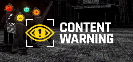
Content Warning scored 82/100 on Steam Analyzer — Good for a Horror capsule. Top priority fix: [contrast_color] Add a subtle rim light or bright edge highlight to the dark character silhouettes to separate them from the near-black background at tiny size

Capsule scores by dimension

  • Genre Clarity: 7/10 — Co-op horror filming game implied. The group of dark figure characters with emoji-style helmet heads, a film clapperboard, and a foreboding dark industrial background collectively suggest a co-op social/horror experience. The eye with exclamation mark logo reinforces a content-creation or surveillance theme. At tiny size the genre blend of horror and social/filming is still loosely readable from the silhouetted group and warning iconography, though 'filming simulator' specifics are lost.
  • Title Readability: 9/10 — Bold white title reads at all sizes. The 'CONTENT WARNING' logotype is set in a large, heavy sans-serif typeface in high-contrast white on the dark right half, making it extremely readable even at tiny thumbnail size. The two-line stacked layout uses the full vertical space efficiently and no decorative flourishes compromise legibility. At small and tiny sizes this remains the dominant readable element, which is a strong asset.
  • Contrast & Color: 8/10 — Strong yellow-white pop on dark field. The bright yellow warning-eye logo and the white title text create excellent value separation against the near-black desaturated background. The colorful emoji helmet heads on the left characters add chromatic variety and act as focal anchors against the dark figures. In grayscale the title and logo still pop clearly, though the dark character silhouettes can partially merge with the dark background at tiny size.
  • Uniqueness & Polish: 8/10 — Distinctive emoji-head crew concept. The emoji traffic-light helmet heads on black humanoid figures is a genuinely memorable and unusual visual hook that communicates the game's quirky personality immediately. The combination of the corporate-style warning eye logo alongside the absurd characters creates a clear tonal identity that stands out from generic horror or action capsules. Craft is solid though the background environment could be more detailed to elevate polish further.
  • Brand Consistency: 9/10 — Iconic warning eye and emoji heads. The yellow warning-eye symbol paired with the smiley-face helmet characters forms a cohesive and recognizable visual language that would be immediately identifiable in a sequel or DLC context. The monochromatic dark palette with yellow accent is maintained consistently across both the logo and the background tone. The film clapperboard detail reinforces the in-game filming mechanic, tying the capsule tightly to the game's core identity.
  • Composition: 8/10 — Clear left-right split with strong hierarchy. The design uses a confident left-right split: the character group with the warning-eye logo on the left third and the large title text occupying the right half. The yellow eye logo acts as a visual bridge between the two zones and sits near the center, creating a natural focal path from characters to logo to title. At small size the title dominates appropriately, though the character group becomes quite small and detailed emoji heads compress; the composition still holds without feeling cluttered.

What works

  • Highly legible title at all sizes. The bold white sans-serif 'CONTENT WARNING' text remains clearly readable even at 120x45 thumbnail size due to high contrast and large weight.
  • Memorable character design. The emoji-helmet crew is an instantly distinctive visual hook that communicates the game's quirky co-op identity in a crowded horror-adjacent space.
  • Strong yellow accent anchors the design. The yellow warning-eye logo creates a bright focal point that draws the eye and pops cleanly against the dark Steam background color.
  • Cohesive brand identity. The warning eye symbol, color palette, and character style form a tight visual system that is recognizable and ownable as a brand.

What hurts the capsule

  • Dark character silhouettes merge at tiny size. The black-clad figures blend into the near-black background at 120x45, reducing the group's readability and visual impact at the smallest viewing size.
  • Background environment is underdeveloped. The desaturated industrial background adds depth but lacks distinctive detail, making the setting feel generic and missing an opportunity to reinforce the game's unique underground filming premise.
  • Genre ambiguity at tiny size. At tiny thumbnail size the filming clapperboard detail is lost, making the co-op filming mechanic indistinguishable from a generic horror co-op game.
  • Left zone feels slightly crowded. The four characters plus the warning-eye logo and bracket frame compete for attention in the left half, slightly diluting the focal hierarchy at small sizes.

Priority fixes

  1. [contrast_color] Add a subtle rim light or bright edge highlight to the dark character silhouettes to separate them from the near-black background at tiny size
  2. [genre_clarity] Make the film clapperboard larger or more prominent in the composition so the filming mechanic reads at small and tiny sizes
  3. [composition] Slightly reduce the number of characters shown or tighten the group cluster to reduce left-zone clutter and improve small-size readability
  4. [uniqueness_polish] Add more environmental storytelling detail to the background such as a visible descent shaft or SpöökTube screen to reinforce the unique game premise

Store copy priority fixes

  1. [hook_strength] Replace the opening of the detailed description. Instead of 'Get famous or die trying! Content Warning is a co-op horror game where you film spooky stuff with your friends to go viral,' lead with a visceral detail: 'Descend into the depths with your crew, camera in hand, hunting nightmarish creatures and cursed relics while your oxygen depletes—every second of footage is currency toward fame.'
  2. [feature_communication] Expand the monster/threat section with specific encounter types and behaviors. Replace generic 'Scary animated physics monsters' with concrete examples: 'Face shambling horrors, teleporting entities, or creatures that hunt by sound—each demands different filming tactics and survival strategies.'
  3. [uniqueness] Add a sentence explicitly differentiating this from standard horror co-op games. Example: 'Unlike typical survival games, your progress isn't tied to combat skill—it's tied to creating entertaining footage, meaning failed runs and friend deaths can be your funniest moments.'
  4. [genre_clarity] Clarify the roguelike structure earlier. Add after 'diving bell' description: 'Each expedition is procedurally generated; you'll face new layouts, creatures, and hazards every run, keeping the footage fresh and unpredictable for your SpöökTube audience.'

Related guides

Steam app ID: 2881650 · Tags: Horror, Online Co-Op, Procedural Generation, Exploration, Action Roguelike