Scoring genre clarity...

Fears to Fathom - Woodbury Getaway capsule

Fears to Fathom - Woodbury Getaway

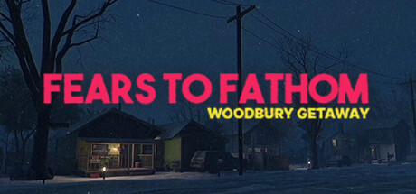
Sydney Harper, a 23-year-old working at a consulting firm plans a weekend getaway to a Woodbury rental with her college friends. Little did she know what was about to unfold during their stay.

$4.99Very Positive(61)
Psychological HorrorAdventureHorror
Rayll StudiosSep 12, 2024

Fears to Fathom - Woodbury Getaway scores 67/100 — better than 18% of Psychological Horror capsules (n=2,215).

Very Positive (61 reviews) · $4.99 · Released Sep 12, 2024 · By Rayll Studios

Quick text summary

Fears to Fathom - Woodbury Getaway scored 67/100 on Steam Analyzer — Solid for a Psychological Horror capsule. Top priority fix: [composition] Add a foreground focal element such as a character silhouette, a threatening figure, or a key object near the house to create depth hierarchy and a clear visual anchor at small sizes.

Capsule scores by dimension

  • Genre Clarity: 7/10 — Horror thriller mood clear. The dark, snowy suburban nighttime scene with bare trees and a lone lit house communicates a horror or psychological thriller tone effectively. At small size the eerie quiet suburban setting still reads as ominous, suggesting a narrative horror or walking sim genre. At tiny size the scene collapses into a dark blue blob with a pink text blob, but the horror connotation survives through color contrast alone.
  • Title Readability: 7/10 — Main title bold, subtitle weak. FEARS TO FATHOM uses a bold hot pink sans-serif that punches well against the dark blue scene at full and small sizes. The subtitle WOODBURY GETAWAY in yellow is readable at full size but becomes very difficult to parse at tiny size due to smaller weight and lower contrast against the mid-dark background. No outline or drop shadow supports either text block, which limits resilience at small sizes.
  • Contrast & Color: 7/10 — Strong pink pops, scene dark. The hot pink title creates strong value and hue separation against the dark navy scene and the Steam dark background of #1b2838. The scene itself is low contrast — dark blue sky, dark trees, dim snow — which means the scene elements largely merge at tiny size. In a grayscale test the pink title becomes the dominant anchor, which is effective, but the scene silhouette provides very little supporting separation.
  • Uniqueness & Polish: 6/10 — Competent but genre familiar. The hot pink title on a dark realistic 3D suburban horror scene is a recognizable aesthetic for low-budget indie horror games, echoing titles like Lethal Company or similar. The craft is clean and intentional — the lighting on the house and falling snow add atmosphere — but there is no striking visual hook or unique selling point that differentiates it from similar capsules in the space. It reads as competent but not memorable.
  • Brand Consistency: 7/10 — Distinct pink-on-dark identity. The hot pink bold title on a dark photorealistic or near-photorealistic 3D scene appears to be a consistent identity signal for the Fears to Fathom series, which likely uses this same typographic treatment across episodes. The palette of cool dark blues with a single warm light source and the aggressive pink wordmark functions as a recognizable series identity cue. Within this episode the art direction is internally cohesive with no conflicting styles.
  • Composition: 6/10 — Centered title, passive scene. The title block sits in the center-left of the image and is well-placed over the darkest region of the sky, giving it a relatively controlled background. However the scene itself is a wide establishing shot with no strong focal subject — no character, no threatening figure, no focal object pulling the eye. At small and tiny sizes the scene becomes a dark atmospheric wash with a pink text blob, which is functional but misses an opportunity to create a more dynamic compositional hierarchy with a foreground element.

What works

  • Hot pink title survives small sizes. The bold pink FEARS TO FATHOM wordmark maintains strong contrast against both the scene and Steam's dark background even at tiny thumbnail scale.
  • Atmospheric horror mood. The dark snowy suburban nighttime setting with a single warmly lit house communicates dread and isolation effectively at full and small sizes.
  • Clean typographic placement. The title is positioned over the darkest area of the sky, avoiding competition with textured or bright scene elements.
  • Series identity cohesion. The bold pink wordmark on a dark realistic scene appears to be a consistent series-wide identity marker, aiding franchise recognition.

What hurts the capsule

  • Subtitle unreadable at tiny size. WOODBURY GETAWAY in yellow at smaller weight is illegible at 120x45 and even challenging at 231x87 without careful inspection.
  • No focal subject in scene. The wide establishing shot has no character, silhouette, or foreground object to anchor the eye, causing the scene to read as passive atmosphere only.
  • Scene collapses at tiny size. The dark blue scene with similarly valued elements — trees, sky, snow, house — merges into a near-uniform dark mass at tiny thumbnail scale.
  • Generic indie horror aesthetic. The pink-title-on-dark-3D-scene combination is common enough in low-budget indie horror that it does not immediately stand out in a crowded genre browse.

Priority fixes

  1. [composition] Add a foreground focal element such as a character silhouette, a threatening figure, or a key object near the house to create depth hierarchy and a clear visual anchor at small sizes.
  2. [title_readability] Increase the subtitle WOODBURY GETAWAY in size, weight, or add a subtle drop shadow or outline so it remains legible at 231x87.
  3. [contrast_color] Brighten or add a rim-lit silhouette in the scene midground to increase value separation and give the background more readable structure in grayscale and at tiny size.
  4. [uniqueness_polish] Introduce a distinctive visual hook — a glimpsed threat, an unusual lighting effect, or a scene detail that teases the specific story — to differentiate this capsule from generic indie horror entries.

Store copy priority fixes

  1. [hook_strength] Rewrite the short description to open with a specific, sensory hook tied to the horror: 'A quiet weekend getaway takes a sinister turn when Sydney and her friends discover they're not alone in the Woodbury rental—and their choices determine who makes it out alive.' This replaces vague foreshadowing with concrete threat and player agency.
  2. [feature_communication] Expand the detailed description to explain how fishing, text messages, and voice activity integrate into the survival and narrative experience—e.g., 'Receive urgent texts from friends making different choices,' 'Make moral decisions while exploring,' etc.—so players understand the gameplay loop.
  3. [uniqueness] Add 1-2 sentences articulating what makes Woodbury Getaway distinctive, such as 'The fifth episode deepens the anthology's mystery by introducing a persistent threat spanning multiple timelines' or a specific setting/threat unique to this episode.
  4. [audience_targeting] Clarify the intended audience by signaling choice consequence weight and difficulty: 'For players who enjoy narrative horror where every decision matters and survival is never guaranteed.'

Related guides

Steam app ID: 2961530 · Tags: Psychological Horror, Adventure, Horror, First-Person, Casual