Scoring genre clarity...

THE LAST PORTRAIT capsule

THE LAST PORTRAIT

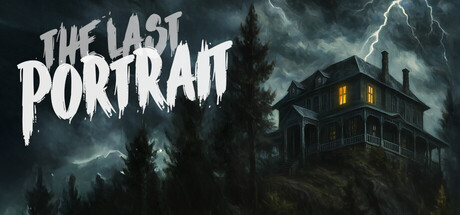
THE LAST PORTRAIT is a haunting adventure that leads you into the abandoned Ashwood Manor. You are a lawyer who has inherited the house from a client and wants to uncover its secrets. Solve tricky puzzles and escape the spirit that guards the estate!

$7.199 user reviews
HorrorPuzzleAtmospheric
LOCKDOWN AdventuresMay 22, 2026

THE LAST PORTRAIT scores 67/100 — better than 19% of Horror capsules (n=3,210).

9 user reviews · $7.19 · Released May 22, 2026 · By LOCKDOWN Adventures

Quick text summary

THE LAST PORTRAIT scored 67/100 on Steam Analyzer — Solid for a Horror capsule. Top priority fix: [uniqueness_polish] Introduce a visible ghost figure or glowing portrait element into the composition to communicate the unique gameplay hook and differentiate from generic haunted house imagery.

Capsule scores by dimension

  • Genre Clarity: 8/10 — Horror adventure manor clearly communicated. The stormy Victorian manor on a hill with lightning strike is an immediately recognizable horror adventure setting. At tiny size the haunted house silhouette with lit windows reads clearly against the dark stormy sky, strongly implying a mystery or horror adventure genre. The genre cues are genre-appropriate and unambiguous, though it leans more horror than puzzle-adventure.
  • Title Readability: 7/10 — Readable at full, marginal at tiny. The hand-painted dripping white font for THE LAST PORTRAIT has good contrast against the dark stormy background at full size, with a rough texture that suits the horror theme. At small size the title remains mostly legible due to its large relative scale and placement in the upper left. At tiny size 'THE LAST' holds up but 'PORTRAIT' begins to lose its letter definition due to the decorative serif-adjacent strokes, though it remains broadly readable.
  • Contrast & Color: 7/10 — Strong dark atmosphere pops on Steam. The predominantly dark grey and black palette with the bright lightning strike and warm amber window glow creates strong value separation that works well against Steam's #1b2838 background. The manor silhouette reads cleanly in grayscale due to the lighter sky behind it. The white title text has good edge contrast, though at tiny size the mid-tone dark trees in the left foreground can blend slightly into the background reducing depth clarity.
  • Uniqueness & Polish: 5/10 — Competent but generically haunted. The stormy Victorian manor composition is a well-worn horror visual trope and does not distinguish itself strongly from other indie horror titles. The dripping title font, lightning bolt, and dark tree silhouettes are all familiar genre clichés executed competently but without a distinctive hook or unique visual selling point. Compared to top performers like Slay the Princess or COCOON which have memorable and distinctive visual identities, this feels like a solid but generic horror asset execution.
  • Brand Consistency: 6/10 — Coherent dark horror aesthetic. The internal art direction is cohesive with a consistent dark stormy palette, painterly digital rendering style, and horror typography that all work together. The warm amber window light as a focal accent is a smart identity touch that hints at the 'portrait' theme. However there are no truly memorable or unique brand identity signals beyond the title itself that would make this capsule immediately recognizable in a scroll later.
  • Composition: 7/10 — Clear focal hierarchy with manor anchor. The manor is well-positioned in the right-center and serves as a clear focal point anchored by the lightning strike above and the amber window glow. The title occupies the left side creating a balanced two-element layout without excessive clutter. At small size the composition holds reasonably well with the manor and title both remaining visible. The foreground tree silhouettes add depth layering though at tiny size they become undifferentiated dark mass that slightly competes with the manor.

What works

  • Atmospheric manor silhouette. The Victorian house on a hill with lit windows reads as a clear horror focal point even at small thumbnail size.
  • Strong title contrast. The white dripping font sits on a naturally dark region of sky giving it solid legibility at full and small sizes.
  • Lightning as dynamic accent. The lightning strike adds visual energy and draws the eye toward the manor, creating a natural focal hierarchy.
  • Genre-appropriate palette. The dark stormy grey palette with warm amber accent is internally consistent and appropriate for a horror adventure.

What hurts the capsule

  • Generic haunted house trope. The stormy manor composition is one of the most common horror visual clichés and offers no distinctive hook to separate it from dozens of similar indie horror capsules.
  • No ghost or portrait visual hint. The unique selling point of a cursed painting and a guarding ghost is entirely absent from the visual, missing an opportunity for a more distinctive and intriguing composition.
  • Title collapses slightly at tiny size. The decorative letterforms in PORTRAIT lose definition at 120x45 making the second word harder to parse quickly under scroll conditions.
  • Foreground trees add noise at tiny size. The dark pine tree silhouettes on the left merge into an undifferentiated dark mass at tiny size, slightly muddying the otherwise clean depth layering.

Priority fixes

  1. [uniqueness_polish] Introduce a visible ghost figure or glowing portrait element into the composition to communicate the unique gameplay hook and differentiate from generic haunted house imagery.
  2. [title_readability] Add a subtle dark vignette or semi-transparent backing behind the title text to improve letter separation at tiny size, particularly for the word PORTRAIT.
  3. [genre_clarity] Add a subtle puzzle or exploration visual cue such as a key, lock, or mysterious glowing object to hint at the adventure puzzle mechanics beyond pure horror atmosphere.
  4. [composition] Reduce or lighten the foreground tree mass slightly so it reads as a distinct depth layer rather than blending into the dark edges at small and tiny sizes.

Store copy priority fixes

  1. [feature_communication] Add a sentence explaining the core threat mechanic: 'Does the spirit kill you? Can you hide or only flee? Is evasion optional or required to progress?' This removes ambiguity about player agency and stakes.
  2. [uniqueness] Rewrite the opening of the detailed description to emphasize what makes Ashwood Manor distinct—e.g., 'The mansion is a private art gallery frozen in time; uncover how the artwork relates to Isadora's disappearance and Edgar's final hours' rather than restating generic mansion exploration.
  3. [hook_strength] Strengthen the short description's second sentence from 'wants to uncover its secrets' to a more specific, emotionally charged hook: 'but an unseen force guards its darkest chambers—and may not let you leave alive.'

Related guides

Steam app ID: 3691530 · Tags: Horror, Puzzle, Atmospheric, First-Person, Psychological Horror