Steam Analyzer Benchmark · 2026 edition
The Steam Capsule Benchmark Report 2026
We reviewed 5,000+ Steam capsules to find the patterns behind clearer, more readable store art. 13 earned a 90+. 3,562 scored 70+. See the data, examples, and common mistakes.
Citable facts · 2026 benchmark
- Sample size. This benchmark scores 5,000+ Steam capsules across six visual dimensions.
- Median score. The median Steam capsule scores 72/100; the 90th percentile sits at 80.
- Top tier. 13 capsules (0.3%) reached the Exceptional band at 90+.
- Strong-or-higher reach. 71.2% of capsules sit in the Strong band or higher (70+).
- Weakest dimension. Uniqueness and polish is the lowest-scoring dimension, mean 6.68/10.
- Highest-leverage dimension. Uniqueness and polish correlates most strongly with overall score, Pearson r 0.88.
- Most common pitfall. 69.4% of capsules fail the 120×45 thumbnail test on at least one dimension.
Cite as: The Steam Capsule Benchmark Report 2026, Steam Analyzer. Numbers update daily via ISR; the date you accessed the page is part of the citation.
The median Steam capsule scores 72 / 100. The 90th percentile sits at 80. The 99th at 87. 71.2% of capsules reach the Strong band or higher (70+), and 86.2% reach Solid or above (65+). The distribution is tight — standard deviation 7.82 — clustered around competent execution with a thin upper tail and a small lower one.
The dimension most teams score lowest on (uniqueness & polish, mean 6.68) is also tied for the dimension that most predicts overall score (Pearson r 0.88 with overall, alongside composition).
n = 5,000 capsules · 13 at 90+ · scoring rubric: six visual dimensions, each rated 1–10, aggregated to a 0–100 overall · daily ISR
The rest of this page documents the distribution up close, the dimensional anatomy of every score band, and seven findings that matter when you sit down to redo a capsule.
The score-band framework
Every capsule analyzed on Steam Analyzer receives a 0–100 score and a band label. The bands are documented in the scoring methodology and shown on the per-game results page, so this report speaks the same vocabulary developers see on their own analysis.
Half the field lives in Strong. The Exceptional band is the smallest cohort by a wide margin, which makes it the cleanest signal of where the upper bound of craft currently sits.
| Tier | Score | Capsules | Share |
|---|---|---|---|
Exceptional | 90–100 | 13 | 0.3% |
Standout | 85–89 | 173 | 3.5% |
Very Strong | 80–84 | 424 | 8.5% |
Strong | 70–79 | 2,952 | 59% |
Solid | 65–69 | 749 | 15% |
Average | 50–64 | 621 | 12.4% |
Weak | 0–49 | 68 | 1.4% |
Exceptional reached by 13 of 5,000 capsules (0.3%). Strong + Very Strong combined accounts for 67.5% — competent execution, with room to climb into Standout and Exceptional via the craft levers below.
Score distribution
Bins are 10 points wide. The gold sliver at the top is the Exceptional band (90+). Greyed bars below 60 are capsules under the indexability floor — shown for transparency, excluded from per-genre breakdowns further down.
Percentile anchors: p10 = 62, p25 = 68, median = 72, p75 = 77, p90 = 80, p95 = 83, p99 = 87. If your overall is below p25 you're in the bottom quarter of the analyzed pool; above p90 puts you in the top tenth.
The dimension benchmark
Per-dimension means and percentiles across the full pool, plus the dimension's correlation with overall score and the gap between a Strong capsule (70–79) and a Standout (85+).
Two numbers do most of the work in this table. Correlation tells you how much a one-point gain on this dimension moves your overall. Strong→Standout gap tells you how much the upper-band cohort outperforms the middle on exactly this axis — i.e., the ceiling lift you have left.
| Dimension | Mean | p10 | p90 | % at 9+ | Corr | Standout gap |
|---|---|---|---|---|---|---|
Genre Clarity | 7.20 | 6 | 8 | 6.7% | 0.81 | +1.36 |
Title Readability | 7.66 | 6 | 9 | 14.6% | 0.69 | +0.83 |
Contrast & Color | 7.70 | 7 | 9 | 10.5% | 0.80 | +0.89 |
Uniqueness & Polish | 6.68 | 6 | 8 | 1.6% | 0.88 | +1.41 |
Brand Consistency | 6.45 | 5 | 8 | 3.2% | 0.80 | +1.83 |
Composition | 7.25 | 6 | 8 | 3.5% | 0.88 | +1.27 |
Mean and percentiles are on the 1–10 dimension scale. Title readability has the highest mean (7.66) but the lowest correlation with overall (0.69). Uniqueness & polish has the lowest mean (6.68) and tied-highest correlation (0.88). Brand consistency has the biggest Strong-to-Standout gap (+1.83) — the dimension that moves a competent capsule into the upper band.
Finding 1: 69.4% of capsules fail the thumbnail test
The most common single failure mode in the dataset is not bad art. It is art designed for the wrong size.
Steam renders your small capsule as small as 120×45 in some rails. 69.4% of analyzed capsules have at least one phrase in their scoring flagging a tiny-size legibility issue — title collapses, subtitle illegible, ornament lost, character silhouette blurs, genre ambiguity at small size, or the icon recedes against #1b2838.
Cluster · per-capsule rate
Fails the 120×45 thumbnail test
Full pool
69.4%
Bottom quartile
83.3%
Top quartile
65%
Even the top-quartile capsules get flagged for some small-size weakness 65% of the time. The difference at the top isn't the absence of the issue; it's the presence of compensating moves elsewhere — controlled background zones for the title, stronger value contrast, simpler silhouettes.
The fix is not nicer art. It is testing every capsule at 120×45 on a #1b2838 background, in your design tool, before signing off. The same blur test, grayscale test, and squint test from the capsule design guide each catch a different version of this failure. Most teams approve at 920×430 and stop. The rail is what the player sees.
Full rules for capsule sizes live in Steam's asset documentation. But the testing protocol isn't in the docs. It's on you.
Finding 2: the dimension teams score lowest on is the one that pays the most
Of the six dimensions, the one capsules score lowest on is uniqueness & polish — mean 6.68 across the full pool, with only 1.6% of capsules scoring 9 or above on it.
It's also tied for the dimension most correlated with overall score (Pearson r 0.88, alongside composition at 0.88). And it's the dimension where bottom-quartile capsules sit farthest below the top quartile (5.65 vs 7.59, a gap of 1.94 points — the largest of any dimension).
The leverage move
Uniqueness is the cheapest dimension to under-invest in and the most expensive to leave low. The other five dimensions cluster their means in the 7.07–7.58 range; uniqueness sits alone at 6.68. That's where the easiest point is.
What this looks like in practice: 75% of capsules in the dataset get flagged for generic, template-feeling, or interchangeable visual style. In the bottom quartile that climbs to 83%. In the top quartile it drops to 52.7%. The 30.3-point gap between bottom and top on this single cluster is the second largest in the dataset.
Translation: most teams default to genre conventions because conventions are safe. The data shows the safe move is the low-scoring move on the dimension that most predicts the overall. If you're choosing one place to push on, push here. One ownable hook. A strange silhouette. A specific world detail. A title treatment that belongs to your game and no one else's.
Finding 3: brand consistency is the ceiling separating Strong from Standout
Among the six dimensions, the one where the 85+ cohort separates from the 70–79 cohort the most is brand consistency — a 1.83-point gap (Strong cohort mean 6.61, Standout cohort mean 8.44).
That's the largest Strong→Standout gap of any dimension. Bigger than uniqueness (1.41), bigger than composition (1.27), much bigger than title readability (0.83).
Brand consistency is scored on internal cohesion only — same font family, same stroke or shadow treatment, the same kind of accent colour, a recognisable signature motif. Not whether the capsule matches your trailer (that's judged elsewhere). The Standout cohort isn't prettier than the Strong cohort in any obvious way. It's more recognisable. Pull up three capsules side by side and you can feel the same hand at work.
If you're already scoring in the high 70s and looking for what takes you past 85, this is the lever. A repeating element a fan could point at and say “that is a [studio name] capsule.” You don't need a mascot. You need one visual signature carried consistently across whatever capsules you have.
Finding 4: title readability is a hygiene floor, not a competitive lever
Title readability has the highest dimension mean (7.66), the tightest distribution (stdev 1.03), and the lowest correlation with overall score (0.69). The bottom quartile averages 6.61 on it; the top quartile averages 8.46. The Strong→Standout gap is 0.83 — the smallest of any dimension.
Read that another way: almost everyone gets the title legible enough. It's the easiest dimension to outsource, the cheapest to fix, and the one where the variance between bands is smallest. Polishing your logo past “readable” on a clean Steam dark background buys you very little overall lift compared to the same hour spent on uniqueness or brand.
Caveat — and it matters: this finding only applies after you clear hygiene. If your title isn't readable at 120×45 you're below the floor and nothing else compensates. Above the floor, more title polish stops paying. "Polished, intentional craft" is the strength most over-indexed in the top quartile (19.3% top vs 8.2% bottom), but it shows up across the whole capsule — typography, lighting, edges, materials — not just the logo.
Finding 5: failure modes travel together — fix the root, not the symptom
Pitfalls don't arrive alone. When we ask which two clusters most over-occur together relative to chance, "fails the thumbnail test (120×45)" and "subtitle or tagline unreadable at small size" co-occur at lift 1.34 — meaning they appear together 34% more often than independence would predict.
That isn't coincidence. It's the same underlying problem expressed two ways. The capsule that gets flagged for low value contrast almost always also has a muddy or undisciplined palette. The capsule flagged for weak brand identity almost always also has generic visual style. Fix the upstream cause and both phrases disappear from the next scoring pass.
| Pair | Both | Lift |
|---|---|---|
| Fails the thumbnail test (120×45)+ generic, template-feeling visual style | 2437 | 0.94× |
| Weak or generic brand identity+ generic, template-feeling visual style | 1731 | 1.19× |
| Fails the thumbnail test (120×45)+ weak or generic brand identity | 1128 | 0.84× |
| Fails the thumbnail test (120×45)+ no single dominant focal point | 1115 | 1.14× |
| No single dominant focal point+ generic, template-feeling visual style | 1002 | 0.95× |
| Fails the thumbnail test (120×45)+ subtitle or tagline unreadable at small size | 836 | 1.34× |
Practical implication: the priority-fixes list on your analysis isn't six independent items. It's usually two or three underlying decisions expressed as multiple surface symptoms. Fix the root call (the silhouette, the palette, the title-zone choice) and three symptoms resolve at once. Edge cases — like “edge crop” flagged in the top quartile more than the bottom — usually mean the top capsule is doing something ambitious that requires a tighter composition; the bottom isn't flagged because it has no detail near the edge to lose in the first place.
Finding 6: genre averages cluster, but per-dimension weak spots don't
Across the 12 genres past the cohort floor (n >= 25), average overall scores cluster tightly — from 71 to 73. So in aggregate, genre is not destiny. But once you split by dimension, genre absolutely shapes which dimension you're likely to struggle on.
- ·Strategy drops to 7.11 on genre clarity — the lowest of any major genre. Mechanically hard to communicate visually at thumbnail size, so the rubric asks for a visible mechanic, not a mood piece.
- ·Action sits at 6.64 on uniqueness & polish — the soft underbelly. Heavy genre conventions in this audience pull everyone toward the same look. Worth budgeting time for the ownable hook.
- ·Colorful averages 73 overall, the highest cohort in the dataset. Above-average on every dimension — this audience self-filters to players who care about presentation, so the floor is higher.
The takeaway isn't “pick a forgiving genre.” The takeaway is: before commissioning your capsule, look at your genre's weak spot on the per-genre table further down this page, and brief the artist specifically about that dimension. If you're in a genre where the field is weak on uniqueness, beating the field is achievable. If you're in a genre where the field is strong everywhere, you need to plan for that.
Finding 7: what the 90+ cohort has in common
13 capsules (0.3%) cleared 90 in the current dataset. Small cohort, so per-dimension means here are directional rather than precise. But the shape of the fingerprint is the interesting part.
| Dimension | 90+ mean | Global mean | Gap |
|---|---|---|---|
Genre Clarity | 9.00 | 7.20 | +1.80 |
Title Readability | 8.92 | 7.66 | +1.26 |
Contrast & Color | 8.92 | 7.70 | +1.22 |
Uniqueness & Polish | 9.00 | 6.68 | +2.32 |
Brand Consistency | 9.31 | 6.45 | +2.86 |
Composition | 9.00 | 7.25 | +1.75 |
What stands out: the 90+ cohort's strongest dimension is brand consistency (9.31), not title or genre clarity. Their weakest is title readability (8.92) — which is also the field's strongest dimension on average. The elite cohort isn't defined by polished logos. It's defined by recognisable identity carried consistently across the rest of the capsule.
Per-genre numbers
Average overall score plus per-dimension means for every genre past the cohort floor. Tap a genre name to jump to its hub page. Read this table by spotting your genre's weakest column relative to the rest of the row — that's where you'll find your easiest win.
| Genre | n | Avg | Genre | Title | Contr. | Uniq. | Brand | Comp. |
|---|---|---|---|---|---|---|---|---|
| Singleplayer | 3173 | 72 | 7.19 | 7.66 | 7.76 | 6.69 | 6.39 | 7.28 |
| Action | 2153 | 72 | 7.25 | 7.69 | 7.83 | 6.64 | 6.33 | 7.28 |
| Adventure | 1904 | 71 | 7.13 | 7.61 | 7.74 | 6.71 | 6.41 | 7.25 |
| Indie | 1860 | 71 | 7.13 | 7.65 | 7.72 | 6.65 | 6.33 | 7.24 |
| 3D | 1615 | 71 | 7.22 | 7.70 | 7.77 | 6.64 | 6.26 | 7.27 |
| 2D | 1596 | 71 | 7.13 | 7.60 | 7.75 | 6.68 | 6.44 | 7.25 |
| Casual | 1468 | 72 | 7.17 | 7.70 | 7.75 | 6.64 | 6.38 | 7.27 |
| Exploration | 1321 | 71 | 7.12 | 7.65 | 7.70 | 6.68 | 6.38 | 7.25 |
| Atmospheric | 1199 | 72 | 7.16 | 7.64 | 7.77 | 6.78 | 6.44 | 7.32 |
| Colorful | 1138 | 73 | 7.25 | 7.75 | 7.83 | 6.82 | 6.55 | 7.37 |
| Strategy | 1120 | 71 | 7.11 | 7.78 | 7.75 | 6.64 | 6.33 | 7.25 |
| Story Rich | 1090 | 72 | 7.11 | 7.58 | 7.72 | 6.86 | 6.57 | 7.32 |
Amber values mark each genre's weakest dimension. Genre & Title = genre clarity / title readability; Contr. = contrast & colour; Uniq. = uniqueness & polish; Brand = brand consistency; Comp. = composition. Lowest cohort floor: n=25. Smaller cohorts excluded for stability.
Bonus: visual mistakes concentrate. Copy mistakes fragment.
Capsule pitfalls cluster sharply. Five clusters explain most of the field. Store description pitfalls don't. Across 4,954 store-copy analyses, the most-cited single pitfall — "no differentiation from competitors" — hits 2.3% of capsules. Every other copy issue is similarly thin.
Capsule failures repeat. Every dev makes the same five mistakes. Store-copy failures fragment — each game finds its own way to undersell itself. Capsule problems are systemic and fixable with checklists. Copy problems are individual and need editing, not rules. A team can hire a freelance illustrator and go from competent to great on the capsule. Hiring a freelance copywriter rarely produces the equivalent jump on store copy — the copy problems are about the writer's knowledge of the game, not the writer's technique.
What 9.0+ looks like, by dimension
Three highest-scoring capsules on each of the six dimensions. Study them when the dimension is your weakness. Score floor: 9.0 / 10 on the dimension.
Genre Clarity


Title Readability
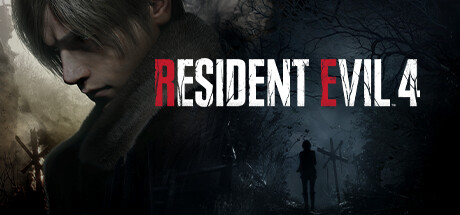

Contrast & Color

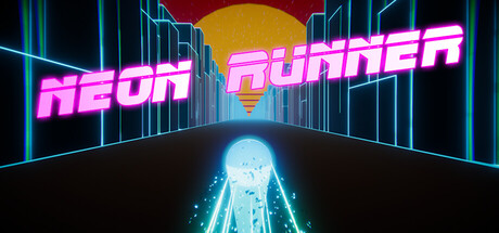

Uniqueness & Polish
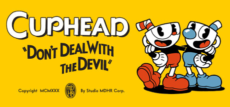

Brand Consistency
What surprised us
A few things in the data ran against what we expected when we started scoring capsules.
The title is the easiest dimension. We thought it'd be the lever.
Most capsule-design advice — including ours, until this benchmark — frames the small-capsule legibility test as the master test. It's still a useful floor. But once a capsule clears legibility, the title stops being the dimension that moves the score. Uniqueness, contrast, and composition all carry more weight from then on.
The 90+ cohort doesn't have the prettiest logos.
Title readability is the elite cohort's weakest dimension — 8.92 vs their strongest, brand consistency at 9.31. The capsules at the top of the dataset are recognisable, not legible-er.
Even the top quartile gets flagged for thumbnail issues.
65% of top-quartile capsules have at least one tiny-size pitfall mentioned in their scoring. The 69.4% headline number isn't “most capsules fail.” It's “the rubric finds something to flag at small size on almost every capsule.” What separates winners is compensating elsewhere — value contrast, focal hierarchy, controlled background zones for the title — not the absence of the flag.
Saturation isn't the lever. Value is.
Capsules with high colour saturation but flat value range score worse than less-saturated capsules with strong light-to-dark progression. The grayscale test the guide recommends — kill the colour and ask whether the subject and title still pop — is brutal and most teams skip it. "Strong value contrast against Steam's dark UI" is mentioned 0.8-points more often in the top quartile than the bottom (12.5% vs 11.7%).
If we had one hour to fix a Steam capsule with this data in front of us, the order would be: thirty minutes on uniqueness (the ownable hook), fifteen on the value-contrast pass (grayscale test, simplify the background), ten on the title placement zone, and five minutes choosing one signature element to repeat across whatever capsules you have. Everything else compounds off those four.
Methodology
Dataset: every Steam game scored on steamanalyser.com. Each capsule scored across six dimensions on a 1–10 scale, aggregated to a 0–100 overall. Full rubric documented in the scoring methodology and the capsule design guide.
Eligibility: web-analyzed Steam games only (not user-uploaded drafts), NSFW and blocked games excluded. The full distribution (sub-60 included) is used for the score histogram and the dimension benchmark so the report represents where the field actually lives. Per-genre tables and quartile-delta findings use the eligible subset (score >= 60) because sub-60 noise distorts small cohorts. Eligible pool at this build: 4,657; full pool: 5,000. Genre cohort floor: n >= 25.
Anonymity: aggregator outputs never expose game name, app ID, or header image. Three documented exemptions surface specific games positively (curated featured exemplars, ranked top-N, dimension exemplars at >= 9.0). The contract is enforced by a regression test that fails the build if a forbidden key leaks into the aggregator shape.
Cluster rates: this edition reports per-capsule cluster rates, not per-mention. A capsule mentioning three flavours of tiny-size issue is counted once. The eight pitfall clusters and eight strength clusters are defined as regular-expression pattern groups in lib/seo/cluster-patterns.ts and exposed in the aggregator so the test guard covers their output shape too.
Statistics: dimension correlations are Pearson r computed across the full pool. Quartile cohorts are computed by splitting on overall score (bottom and top quartiles of the full distribution). The Strong→Standout gap uses the 70–79 and 85+ bands respectively. Co-occurrence lift is observed pair count divided by the expected count assuming independence; lift > 1 means the pair over-occurs.
Cadence: the page rebuilds every 24 hours, so as more capsules are scored the numbers move. Annual republish convention: the 2027 edition will be a separate page when the time comes. Inspect the current snapshot via the scripts/inspect-benchmark-report.ts script in the repo.
FAQ
What is the Steam Capsule Benchmark Report?
A quarterly aggregate of every Steam capsule scored on steamanalyser.com — score distribution, dimension-level statistics, the failure modes that recur across the field, and the patterns that separate the upper bands. Anonymised: patterns and aggregates only, never named-game critique.
How is the data collected?
Every Steam game scored on steamanalyser.com contributes. The full distribution (web-analyzed, non-NSFW, non-blocked) is used for the score histogram and the dimension benchmark so you see where the field actually lives. Per-genre tables and quartile deltas stay on the eligible subset (score >= 60) because sub-60 noise distorts small cohorts. No game name, no app ID, no header image appears in any aggregate. The three documented exemptions surface specific games positively: curated featured exemplars, ranked top-N, and dimension exemplars at >= 9.0 / 10.
Why pattern rates by capsule, not by mention?
The LLM scoring rubric writes pitfalls and strengths as natural-language phrases, so a single underlying failure mode shows up across multiple phrasings ("Title collapses at tiny size" vs "Title illegible at small size" vs "Subtitle becomes illegible at tiny"). Earlier editions of this report reported per-mention rates, which fragmented the headline numbers and understated reality. This edition aggregates phrasings into clusters at the capsule level: a capsule mentioning three flavours of tiny-size issue is counted once. The numbers in the findings below are unique capsules with at least one matching phrase. The methodology section lists the exact clusters used.
Why is uniqueness the lowest-scoring dimension if it's also the most important?
Because uniqueness is genuinely harder to commission than legibility. Hiring a designer who can render a logo cleanly at thumbnail size is a known problem with known shops; commissioning art that's both polished AND not interchangeable with the rest of the genre is harder, more expensive, and easier to get wrong. Most teams default to genre conventions because conventions are safe. The data shows the safe move is also the lowest-scoring move on the dimension that most predicts your overall score. Worth thinking about before commissioning the next capsule.
How often is the report refreshed?
The page rebuilds every 24 hours via incremental static regeneration, so as more capsules are scored the numbers move. Annual republish convention: the 2027 edition ships at a separate URL when the dataset shape shifts; this page stays as the 2026 historical record.
Can I cite this report?
Yes. Cite as "The Steam Capsule Benchmark Report 2026, Steam Analyzer", with the URL and the date you accessed it (numbers move as the dataset grows). The anonymised patterns and aggregates are the right level of granularity to cite. Don't infer named-game claims from the report.
Why don't you name specific games as cautionary examples?
Pattern data is more useful than name-and-shame, and naming specific games as cautionary tales is unfair to developers who shipped them. The aggregator's anonymity contract is load-bearing: capsules below threshold appear only as anonymised pattern frequencies. Capsules above threshold can be surfaced positively. Never as warnings.
Last reviewed: 2026-05-24. Sourced from Steam's official Steamworks documentation and the Steam Analyzer scoring methodology.